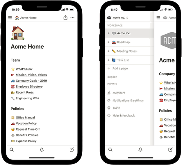
What good AI feels like
Eleven behaviour principles for designing AI assistants that earn their place. After six engagements building AI assistants, the same gaps kept showing up in retros. Memory missed. Handoffs broken. No way to explain why the AI said what it said. Six designers in different rooms solving the same problems six different ways. The fix was not a better feature list. It was a shared view on how the AI should behave.
Why behaviour beats features
Most teams treat AI like a feature. A chatbot in the corner. A "summarise" button. An "ask anything" bar. That framing is what gets you assistants users ignore after the first try.
The teams winning at this are not ahead on model quality. They are ahead on behaviour. Their AI knows when to show up, when to step back, and when to hand off. The principles below are about that. Not features.
Design the behaviour, not the chatbot.
When the AI shows up. When it steps back.
The first three principles are about timing.
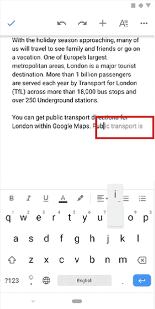
Google Docs
Predictive text appears as you type, illustrating how AI waits until you need help.
Suggests AI tools while the user is already typing.
ChatGPT
The conversational option lives in the same place and only appears when the user calls it.
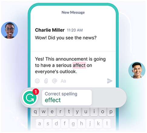
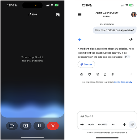
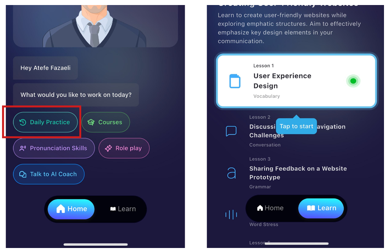
AI appears only when needed
AI shows up when the user asks for it or clearly needs it. It does not interrupt without a reason.
Why it matters. Unwanted AI feels intrusive and breaks trust fast.
Good examples. Google Docs predictive text waits until you type. Instagram surfaces AI tools while you are already typing. ChatGPT's mic button lives in one fixed spot, available only when you call it.
Gmail
When the user is writing an email it offers to help in the background, without jumping in and taking over.
Grammarly
Suggestions appear only when there is an error and stay hidden while the user types.
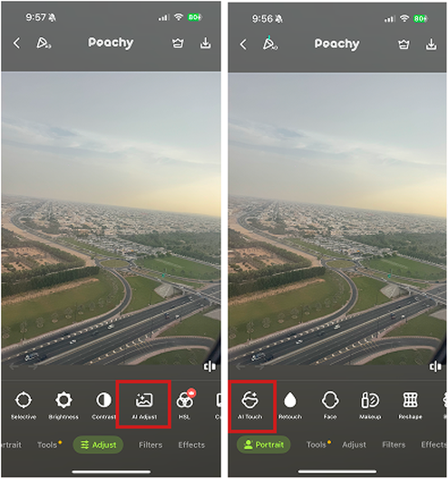
Peachy
If the user is editing a photo manually, AI steps back and only offers help smoothly at each stage of editing.
Show less when the user is confident
When the user is moving smoothly, the AI stays in the background. It becomes visible only when the user might need help.
Why it matters. Confident users do not want help. Showing up anyway is the fastest way to feel patronising.
Good examples. Gmail's "help me write" sits quietly until called. Grammarly only surfaces when there is an error and hides while you type. Peachy lets users edit photos manually and only offers AI on pause.
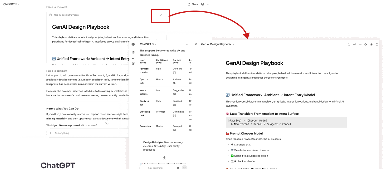
ChatGPT
When the user needs to work on a canvas in ChatGPT it takes the screen fully and gives more room to edit and work on their task.
Current task stays in front
The AI brings something forward only when the user is interacting with it. It never grabs focus uninvited.
Why it matters. If AI takes over the screen or shifts focus without permission, concentration breaks.
Good examples. ChatGPT's canvas expands when the user pulls it open and minimises back when they are done. The user opens the surface. The AI does not.
How users reach the AI, and how the AI welcomes them.
Two principles on entry points and discoverability.
ChatGPT
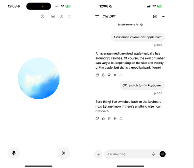
You can switch easily between conversational prompt, typing and voice recording mode — it all stores in the main interface.
Gemini
You can switch easily between conversational prompt, typing and voice recording mode — it all stores in the main interface.
Multi-input flexibility
The AI works across chat, voice, and visual controls. Users mix or switch between them mid-flow.
Why it matters. Different users prefer different modes. Locking the AI to one method loses users with accessibility needs and users who switch contexts.
Good examples. ChatGPT moves between voice and typing in the same conversation with no loss of context. Gemini lets users go from voice to text by tapping the keyboard mid-call.
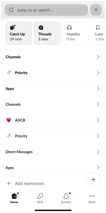
Slack
Customisable navigation lets users choose what they see first.
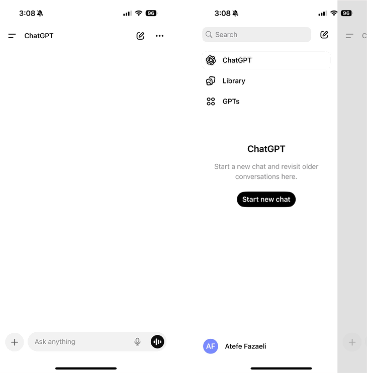
ChatGPT (mobile app)
ChatGPT gives a very quick (swipe-right) and easy access to chat history.
Easy to find, no guesswork
Users never guess what the AI can do or where to find what it has already done.
Why it matters. Hidden features go unused. Hidden history erodes trust.
Good examples. Slack lets users customise what they see first. ChatGPT mobile gives one-swipe access to history.
What scales gracefully. What doesn't.
Two principles on keeping the interface clean as features stack.
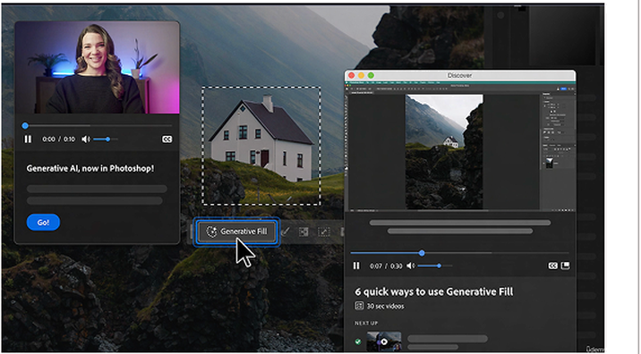
Photoshop
Photoshop reveals relevant tools gradually as the user needs them, without overwhelming.
Notion
Notion neatly fits tools and options into a collapsible menu with a simple structure.
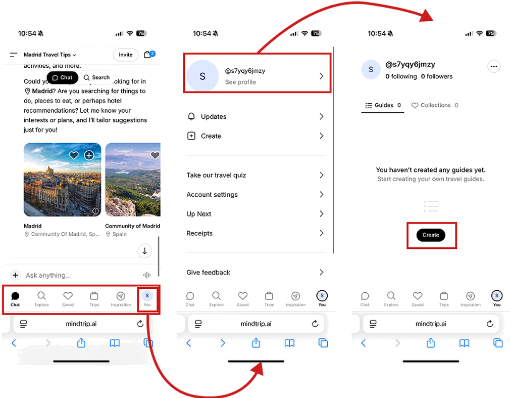
Mindtrip
A simple, structured navigation gives full control to the user and motivates them to stay engaged with the product.
Keep it simple as the system grows
As AI gains features, the interface stays clean.
Why it matters. AI systems get complex quickly. The moment that complexity leaks into the UI, confidence drops.
Good examples. Notion fits a deep feature set into collapsible structures. Mindtrip uses tab navigation that scales without becoming a menu maze. Photoshop reveals generative tools only when relevant to the active layer.
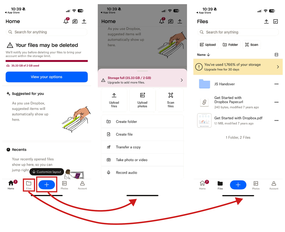
Dropbox
Tapping reveals more options, while secondary features are hidden behind simple menus. Complexity stays hidden unless needed.

Google Photos (video editor)
At first glance you see a basic video player. Only when the user interacts (e.g., taps a control) do advanced editing options slide in.
ChatGPT
Shows the possible actions when the user marks text.
Show more step by step
AI starts with the basics. Extra tools appear gradually as the user shows interest.
Why it matters. Showing everything at once is overwhelming. Step-by-step reveal keeps focus.
Good examples. Dropbox hides secondary actions behind a single tap. Google Photos shows a basic player and slides in editing tools when you interact. ChatGPT gives a short answer first, then offers "see more."
So the user can read the room in a second.
Two principles on visual order and motion.

ELSA Speak
A clear hierarchy in text lets the user focus on what matters most.
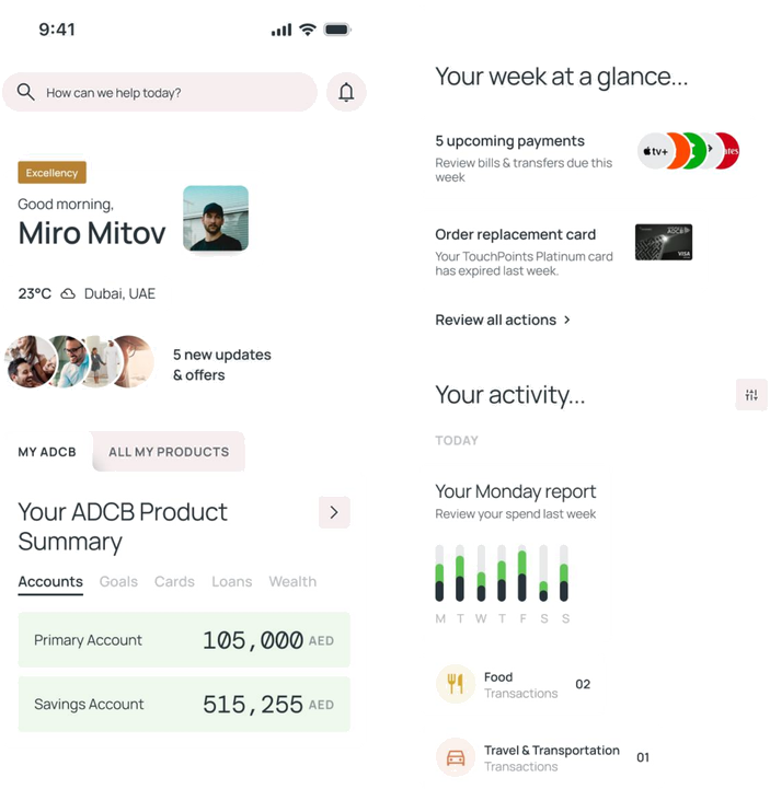
ADCB concept design
A summary of updates and the user's products at the top avoids complication, and the “your week at a glance” section takes the user to the main action or info.
Clear at a glance
In chat, a results panel, or a dashboard, users should see the important thing first without reading every word.
Why it matters. AI produces a lot of output fast. Without visual order, users get lost.
Good examples. ELSA Speak uses hierarchy so users scan to what matters. ADCB's concept design surfaces a "your week at a glance" summary at the top of the dashboard so the user gets the answer before the detail.
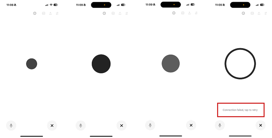
ChatGPT
Voice interaction includes states like “idle”, “listening”, “thinking” and “responding”. Each gives an explanation matching its motion when one is required.
Gemini
Gemini starts the voice prompt with a smooth intro, then continues synced with the AI voice.
Words and movement work together
The way AI moves on screen matches the tone of its words.
Why it matters. If motion is calm but the words are loud, or vice versa, the experience feels disconnected.
Good examples. ChatGPT's voice states (idle, listening, thinking, responding) each carry a matching motion. Gemini's voice intro starts smooth and syncs to the AI's own voice.
The two principles that decide whether users come back.
Memory and explanation.
YouTube
Remembers video playback position and resumes from the last watched timestamp even after closing the app.
ELSA Speak
Suggests continuing the lesson from where the user left off.
Continue where the user left off
The AI remembers what the user was doing so they can pick up instantly.
Why it matters. Forgetting progress makes the system feel unreliable. It is the fastest way to lose returning users.
Good examples. YouTube resumes from the exact second you stopped. ELSA Speak suggests continuing the lesson where you paused. Figma reopens files in the last state.
Gemini
A summarised intro with useful links that explain the privacy policy and how it works.
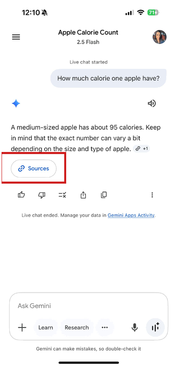
Gemini
A link to the source of the response so users can check the reference if they’re interested.
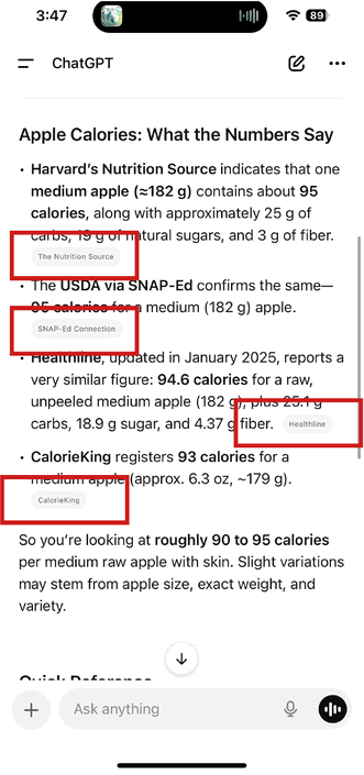
ChatGPT
ChatGPT shows the website links it took the information from as references.
Show how it works
AI explains what it is doing, why, and where the result came from.
Why it matters. Without the "why," users will not trust the AI enough to rely on it.
Good examples. Gemini shows source links inline. ChatGPT cites the websites it referenced. Both put "Source" close to the result, not buried in settings.
How this sits next to existing frameworks
Microsoft's HAX toolkit and Google's PAIR guidebook cover similar ground at the heuristic level. The principles above push further into product behaviour and copy. They are meant to be a working brief, not an academic reference.
The gap the field still has not closed is shipped-product measurement. We can score designs against principles in critique. We cannot yet score assistants on principle adherence after they ship. That is what I would build next.
How to use this list
It is not a checklist. It is a brief. Pick the three principles that matter most for your assistant's role and write them into the design intent before kickoff. The rest surface in critique.